Showing posts with label Black Hours. Show all posts

Saturday, August 29, 2015

Black Blanks: First Design, Second Painted

I've gotten a little behind on my blog posts so decided to talk a bit about the first black blank I designed and why it became the second to be finished.

As I discussed in a previous post, when I became interested in doing black scrolls the first hurdle was going to be putting the design on paper. I tried first using the transfer method with white carbon paper and while it worked to a degree, it wasn't terribly efficient and the lines were not as clean as I liked, however I was pretty sure I could salvage it.

The process for this one actually started out digitally. The last few years I've been doing primarily digital art and I decided to draw my design that way, print it in the appropriate size, then transfer it to the black Bristol. This gave me plenty of leeway for cleanup without damaging the paper. The finished design looked like this:
Not a bad design but turned out a bit more complex than I was used to.

After printing I put a piece of white carbon paper between this and the Bristol and used a bit of artist tape to secure it on all four sides to ensure it stayed in place. After I first started tracing I realized the first challenge was going to be making sure I got all the lines without being able to see them being placed.

I worked out a system of methodical tracing and even with regular interruptions by helpful cats, I still managed to get most of them. Most. Not all. Even with care I ended up missing a couple.

I also realized that even tiny shifts in the paper would throw the lines off which became more apparent when it was completed. Once I pulled all three layers apart I knew I was going to have to find a different way to design on black because of the numerous reasons listed in the previous post.


I started with the gold since that was the bulk of the design on this scroll and quickly noticed that the gouache I use would just roll off the applied lines. In some ways this was a good thing - reducing accidental overpaint for example - but covering lines to correct something was going to be an issue. As well, a lot of the beauty of black manuscripts is the black showing through the open spaces as the lines of the art. Instead mine was showing just the white lines.


After adding the gold I put this one aside a couple weeks while I worked on another. I was putzing around about completing it because I had the quilting pencil by this point which made designing much more efficient and clean for me. But after I finished the second scroll and started on a third, my guilt at leaving this one laying around got the better of me and I decided to finish it.

I thought about colors for a bit and decided how to work them. I knew I wanted the dragon to be green like the Midrealm dragon and white for the bird but the leaves took a bit more thought. I finally decided on red and blue for those and they turned out far better than I was expecting. However during the process of using the non-metallic colors the paint rolling off the lines was even more prominent.

I did a bit of testing and discovered black calligraphy ink would cover the carbon and blend in with the paper so only if someone was inspecting it closely would they be able to tell. With shaky hands, however, this was just one more place to make errors; and I made a few of them. More inefficiency. Eventually I finished it to my satisfaction and I'll pass it along to my Kingdom for use as a scroll. If nothing else it should make a lovely AoA or perhaps children's award.

My goal, even when experimenting, is always to produce something usable. While this isn't perfect (or even great) it is a tremendous step forward in learning for me (since I haven't ever done much work in traditional media) and I still managed to produce something that will benefit my Kingdom.


Saturday, August 22, 2015

Pencils for Drawing on Black Bristol

In the SCA I dabble in scribal art. I like to paint blank scrolls to be delivered to others for calligraphy who then turn them into award scrolls. Once I was introduced to black medieval manuscripts I was hooked and knew I wanted to do some of those.

Working on black Bristol has it's own challenges. I was used to sketching on white Bristol and inking it in black then painting it. Of course when working with black I had to come up with a way to put my design on black for painting that would be visible.

When I drew out my first planned one, I originally drew it on paper then used white carbon paper to "trace" it onto the black Bristol. Even before I completed the process I could tell there were issues why I didn't like it.

First, it's like drawing the piece twice. That's terribly inefficient to me as well as painful. I have arthritis in my hands and having to do the task twice, and the second time having to apply more pressure to get the design to transfer, quickly became painful and resulted in me having to break the process up over three sessions.

Next I discovered that even the tiniest little shift of paper, carbon, or Bristol would foul the design as it was applied. My loving cat helped me discover this one. Upon completion several of the lines were off kilter and I knew I was going to have to try to fix them with paint instead. More extra work.

The lines were extremely heavy. I used my smallest lead pencil to do the transfer work but the lines were still very heavy and thick and stood out way too much on the black paper. Yes, I could see them well, but I could also tell this increased the chance of them remaining visible after painting.

You can't see where the lines are going down as you trace so it's very easy to miss one. I tried to create a methodical pattern of how I placed lines so I wouldn't forget anything but with constant interruptions; phone, rest breaks, cats hawking on the floor or spike-climbing into my lap, I found after it was done that I still had missed a line or two. I did leave two edges taped before taking the assembly apart but even with that and laying the carbon back down to correct threw those lines off.

And last I discovered when trying to paint, carbon lines don't take gouache paint well. Gouache is a type of opaque water paint and when you run it over the carbon lines it likes to roll off. With a heavy application of thickened paint you can manage to finally cover it, but it's more like stacking the paint on and does not cling well.
Sample of the carbon transfer method

After learning this I began looking for something different to try for the next one. That first one was tucked away while I started the second.

What I found through digging on the net and through Amazon was a source of "art" pencils I hadn't thought of; pencils designed to mark dark colored fabrics.

There were several types to choose from and while I mulled over four of them - chalk, soapstone, ceramic "lead", and silver quilting pencil - I eventually settled on testing three.

I found the silver quilting pencil first so that is the one that I began testing. I used it to sketch out my entire second black scroll.

  • Working with it was easy; just like a regular wooden pencil with a soft lead. However because the lead is so soft, if you want a fine line you have to sharpen it more often. 
  • It sharpens easily in the standard plastic back-to-school pencil sharpeners.
  • It does contrast nicely on the black Bristol so your design is visible for painting later yet it doesn't stick out like a sore thumb.
  • It erases easily. This is both a pro- and con. Because the lead is soft it comes off very easily with a kneaded eraser and doesn't risk damaging the paper, however it does rub off easily if you lay your hand on it while working.
  • Paint lays over it very well. You have to lay down a really heavy, repeated line for it to interfere with gouache application and even then a couple extra strokes of the brush resolve it.

Sample of the quilting pencil method
Next I found a ceramic lead pencil at the local fabric store. It's built much like a mechanical pencil with replacement leads and all. I've worked with mechanical pencils for years and this aspect appealed to me so I was eager to try it out. I began a third black scroll using the ceramic lead.

  • It, too, contrasts well on the black paper; even sketches stand out nicely because the lead is white rather than silver. However it is easier to lay a too heavy line so a light touch is needed.
  • It doesn't erase as easily as the quilting pencil. That is advantageous to the person that lays their hand down a great deal as it also doesn't rub off as easily but it makes cleaning up a bad line more of a challenge.
  • The lead is .9mm so it lays a thicker line. I'm a fan of really fine lines and .9mm is considerably larger than what I'm accustomed to.
  • Being a .9mm lead means it also makes an awful squeaky noise when you use it. That is why I was never able to use .7mm mechanical pencils either. They always squeak. It's the kind of noise that makes my skin crawl. Worse than nails on a chalkboard. I found because of the squeaking I couldn't finish drawing out the scroll with this pencil but I got enough done to provide a sample image.

Ceramic lead pencil sample

After working with both of these, I finally gave the soapstone pencil a try. I didn't do enough with it to have sufficient material for a sample photograph.

  • The soapstone was difficult to sharpen. I never did succeed in getting the point small enough to be useful.
  • I did try some sample lines and found it didn't contrast well, and felt strange on the paper. I can't describe it other than that. Like the paper was resisting it's application.
  • It liked to indent in the paper. I found I had to use greater pressure to get it to show up well and that left too much indentation in the surface.
  • I abandoned the soapstone after just a little while because I could tell it wasn't going to be suitable for my needs.
So I ended up settling on the silver quilting pencil. Fortunately they are very inexpensive and relatively easy to find (I found mine in the sewing section of the local WalMart but I've also seen them online at Amazon). Buying them at WalMart is easiest (through Amazon they're an "add-on" item. You have to buy something else worth shipping before they'll send the pencil).

So after my puttering I did end up settling on the first pencil I tried and I'm pretty happy with the results. I'll probably pick up another just to have it in reserve.

Friday, August 21, 2015

Black Hours Online Tales

Recently I've taken an interest in the black manuscripts of the middle ages. I've read two different numbers in my research about how many remain to us; 7 or 9. Either way it is a small enough number that finding good references is challenging. I do most of my reference searching online for expedience and budget reasons. As much as I'd like to spend scads of money on books, it simply isn't feasible. As well, in some ways it is easier to search for something specific directly online.

I've found some bits and pieces of black manuscripts online through digitized collections at various sites and I'm hoping to find more. But those bits and pieces are just that. Small bits in a pool of art that I find damn amazing.

For those unfamiliar with them, black manuscripts, generally Books of Hours, were illuminated manuscripts created in the middle ages. The pages were made of parchment or vellum dyed black and then painted on using period pigments or gold. Even in the few limited examples the artistic styles and techniques vary.

My first contact with black hours was a single image hosted on the Colombia University website for an unfinished black manuscript in the collection of the Hispanic Society of America Museum and Library. What can be seen online of this particular manuscript shows a single image, one left and right page, with the illumination and much of the text done in gold while some of the text is done in white. I have not yet been able to find more of this particular manuscript available to view. You can view that image HERE. (Click the image on that page to view the hi-res version)

I was hooked after seeing that and wanted to see more. Further searches revealed The Black Book of Hours digitized and hosted on the Morgan Museum & Library website. It's the most complete one I've found online yet. You can view it HERE.

I've dabbled with a piece that will have it's own article later based on that book but there were images I kept seeing on Google of another one that I wanted to study; the Black Hours of Galeazzo Maria Sforza. I was finding the same one or two images all over but no other pages. I found an old cached page where digitized images of it was hosted at one time but all the images were gone; there was nothing but little red xs left. The actual manuscript itself is housed at Austrian National Library in Vienna but as far as I can tell the manuscript is not digitized and available online. It's difficult navigating the Digital Reading Room, however, because it's in German and it could be I have just not found it yet. I'll keep looking.

However perseverance did pay off in other areas. Apparently someone else out there hosted 24 images from the Black Hours of Sforza and I was able to find them. Immediately I downloaded them (to avoid losing them all together in case the site they were at was swallowed up by the internet). They weren't particularly good resolution but some is better than none! The images are found on this blog HERE.

This is the one I've been using lately as my reference for a new black piece I'm sketching out and so far I like the look of it the best. I'll include a couple sample images here for others to see. I really love the way the black shows through the colors to provide natural shading and I'm looking forward to trying to duplicate that on my piece.


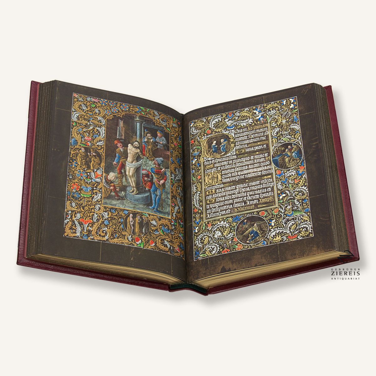
At one point facsimile copies of this particular manuscript were done but only 200 were printed and are extremely rare. I found images of one of them on a rare book dealer auction site that show much more vibrant colors and I wonder if the vibrancy was created during the copy process or if the digitized images above just fail to capture it adequately. You can see one of the images I captured below.

Either way, I feel fortunate to find what I have and I'm very excited to try my hand at creating blank scrolls for Midrealm based on this manuscript. More updates on the work will come as I progress.